—
Bringing an energised new visual identity to a classic English cricket team
—
A Case Study
THE BRIEF
—

Create a sense that this new season is an experience you really don’t want to miss.
—
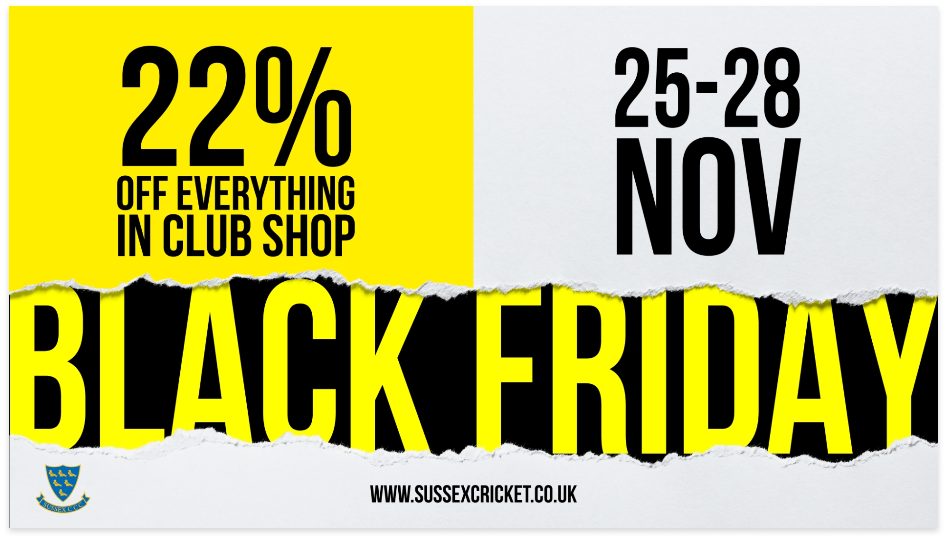
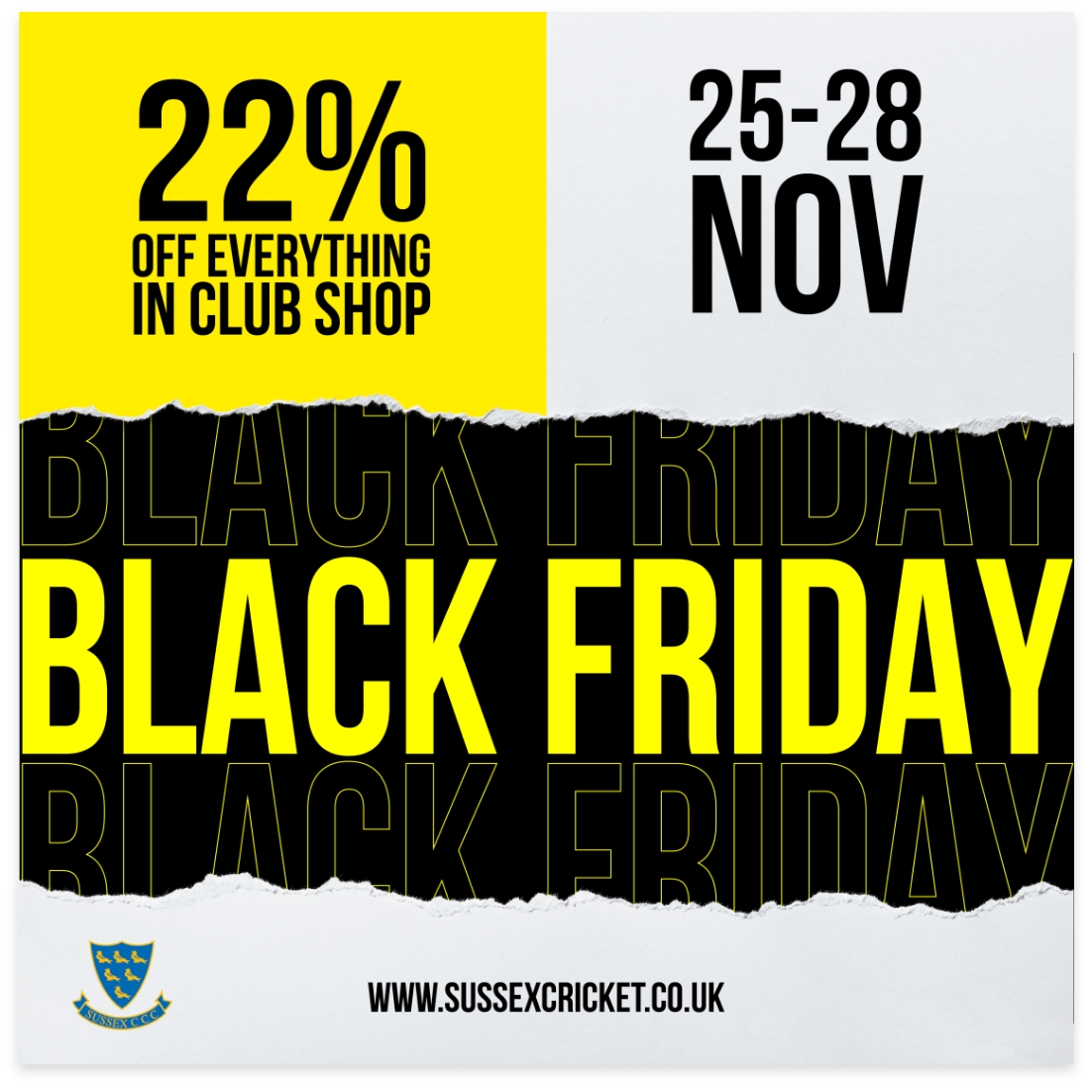
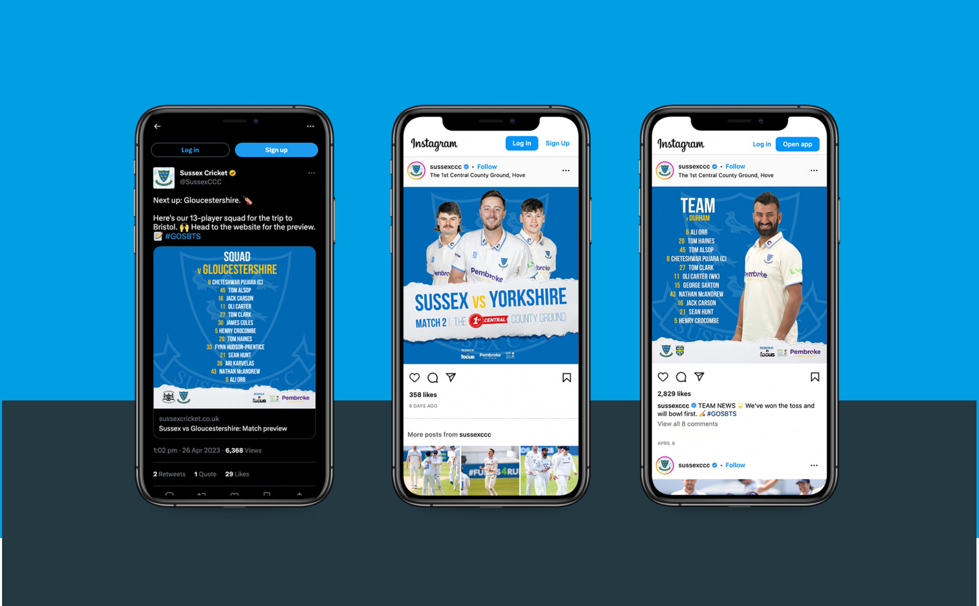
Every year, Sussex County Cricket launches a new campaign to celebrate and drive ticket sales for its upcoming season. O&G has been creating these concepts for over 5 years, coming up with a fresh new look and feel each time. The concept is then rolled out across all of the club’s digital and print assets (including web, social, press advertising, outdoor advertising, handbooks, hospitality brochures and match day programmes).
The goal is to get people excited about the new cricket season — and promote ticket sales to boot. Every year, O&G creates a sense that this new season is an experience you really don’t want to miss. And for fans who attend matches, the design concept offers a feeling of cohesiveness and unity.
Background
—
Sussex County Cricket is the oldest county club in England and Wales, with the loyal fan base to match. This is a club that’s rich in nostalgia, yet also a vital force in today’s sporting world. Any branding or design work for the club needs to honour its history and provenance, while celebrating fresh new waves of promising players — and looking forward to future successes.
—
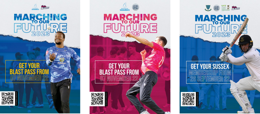
When creating new concepts for the cricket club, there was one big curveball that our creative team had to navigate — the team actually has three different kit designs incorporating four different colours. This is due to cricket having three formats (County, Blast and RL50).
Added to this, Sussex County Cricket is going through a big time of transition and change. It’s
been a tough couple of years, with some established players leaving and a promising wave of young players taking their place. Added to this, a new coach has come on board with a fresh vision and approach. While these changes are positive, they can also create a sense of uncertainty in fans. Our goal was to turn that uncertainty into excitement and anticipation.
—
Creative concepts
Art direction
Design
Development
Project Management
—
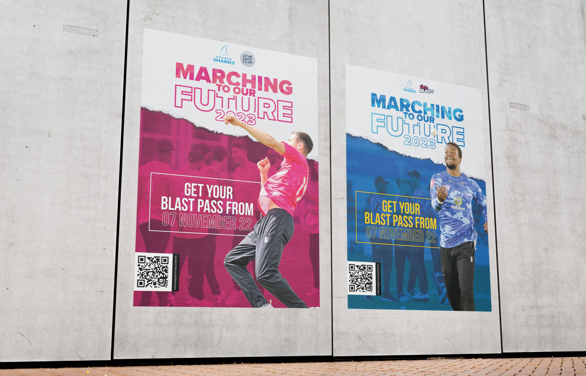
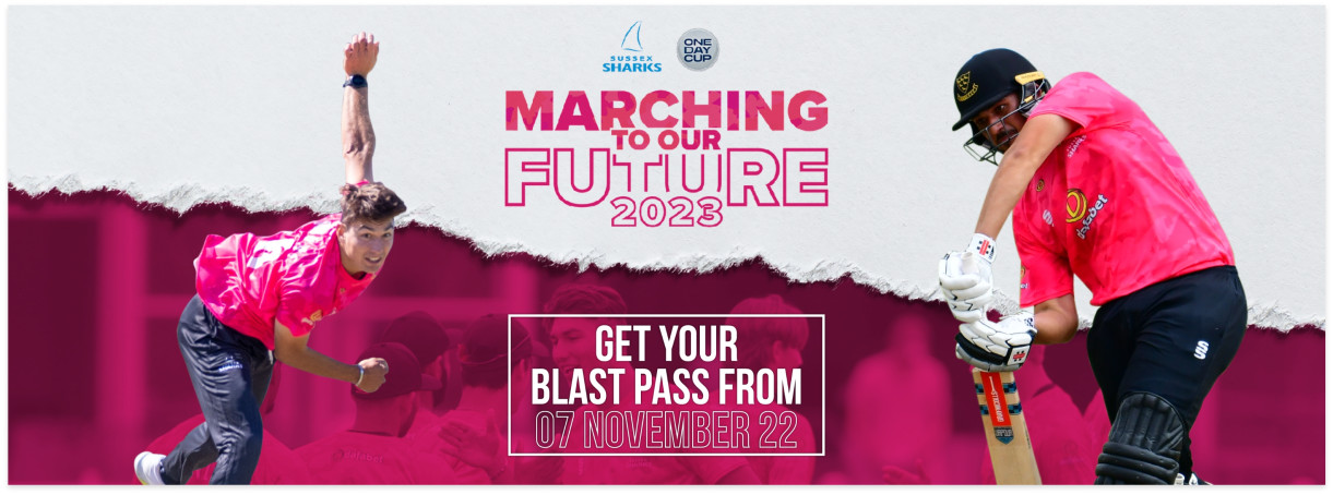
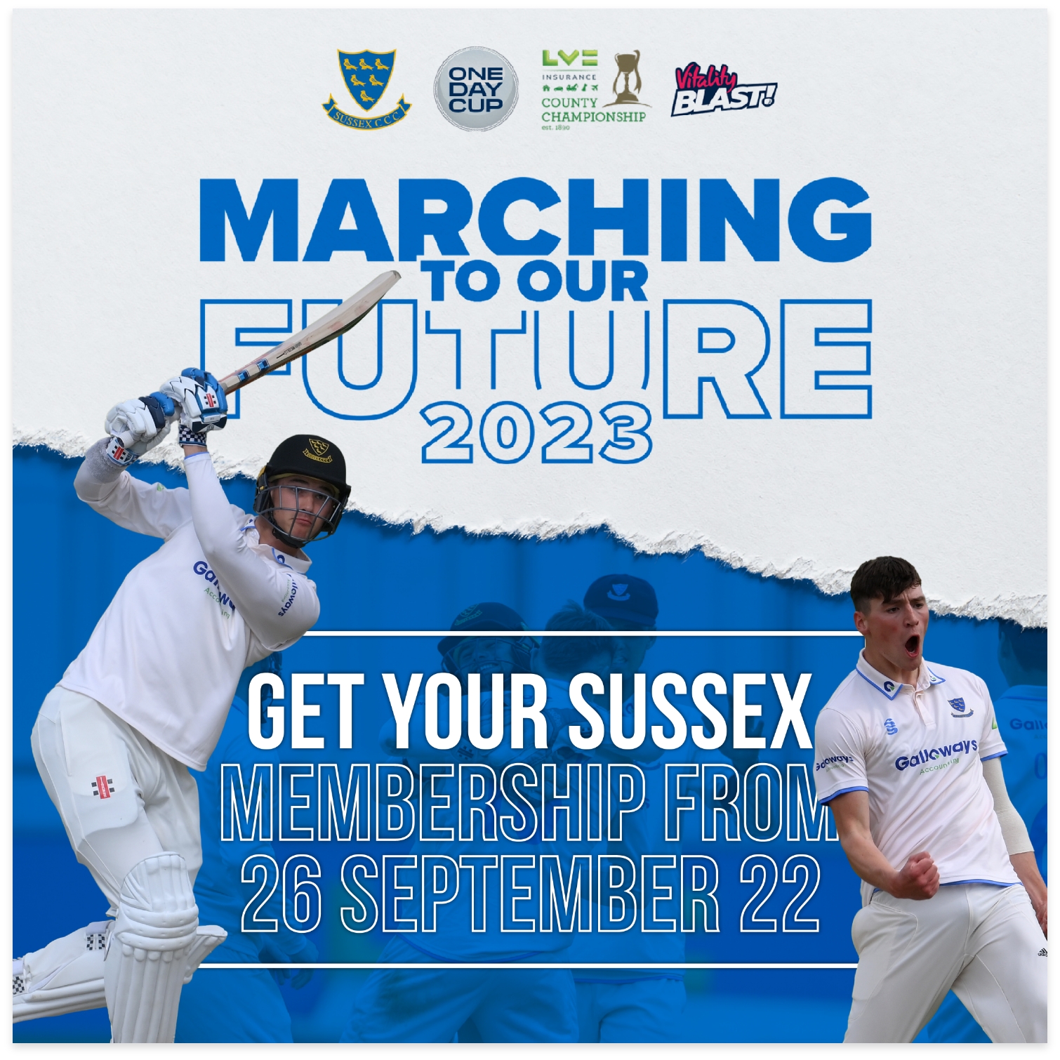
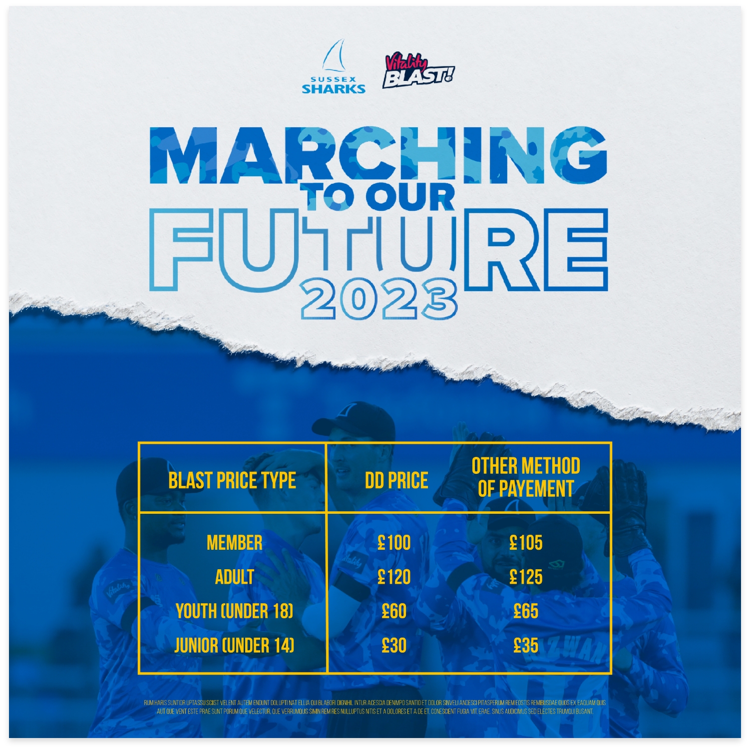
Last year, our creative copywriter devised the strapline ‘Time for Marching’. This year, we evolved that strapline into ‘Marching to Your Future’, to reflect the big, positive changes in the club — the march of new ‘troops’, the fresh new squad ready for battle. The evolved strapline created continuity between this year’s season and last year’s, while also conveying that the club is moving on.
As many of the new players are young and had just finished their first season, we featured them in dynamic hero images to generate a sense of their talent and potential. The message? These players are ready for anything. They deserve your support. It’s time to come and see them in action.
O&G created a unified, energised look that embedded fans in all of the excitement and thrills of the new season. The new look was officially launched in January, in time for the season kick-off in spring.
—
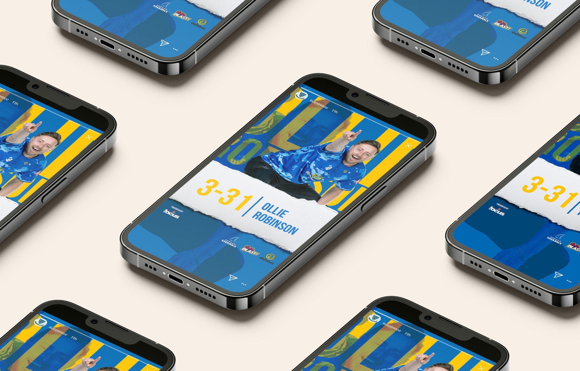
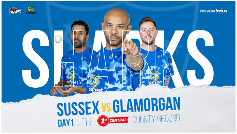
To accompany the strapline, our creative team developed a flexible design concept that worked with all three kit colours. We opted for a bright palette of the official club colours of blue and white, as well as touches of vibrant yellow and pink to express the new energy infused into the team.
We also wanted to show that nothing would hold this team back, that they were a powerful, unstoppable force. So we came up with the core visual concept of ‘the rip’ — a tearing effect in the design intended to suggest that no matter what boundaries or obstacles the players face, they will rip their way through.
This was accompanied by big, bold, unapologetic typography that wasn’t afraid to shout about the team.
LIKE WHAT YOU SEE?
—