—
Change as good as a holiday
—
A Case Study
THE BRIEF
—

Unite Solos’ various product offerings under new visual identities and reposition them to become the first name people think of for independent travel.
—
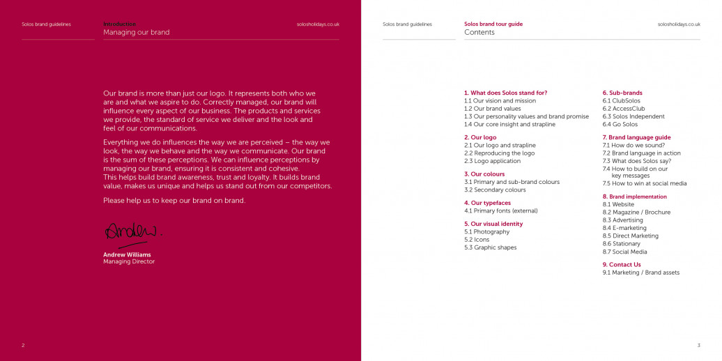
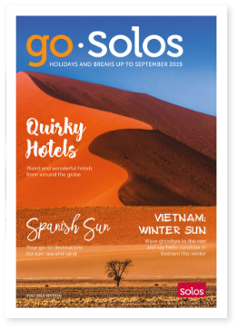
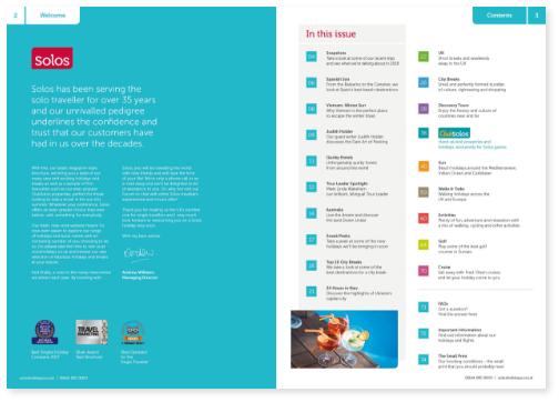
Solos was formed in 1982, specifically to meet the needs of the single traveller. They are the first holiday company to specialise in this market and want to ensure that they are the leading experts within their sector. O&G were briefed with updating Solos’ existing brand guidelines in order to unify their product subsidiaries and ensure consistency across all brand collateral created.
—
Solos weren’t looking for a revolution of their existing branding but rather, an evolution. The subtlety required for this project was particularly important - essentially, the existing brand required updating and ‘tidying up’ across all collateral and products whilst remaining recognisably Solos.
For the Solos’ sub-categories, it was important that each had their own unique identity whilst remaining coherent with and instantly recognisable as a part of the larger Solos company.
—
Design
Editorial design
Copywriting
Art direction
Brand guidelines
THE SOLUTION
—
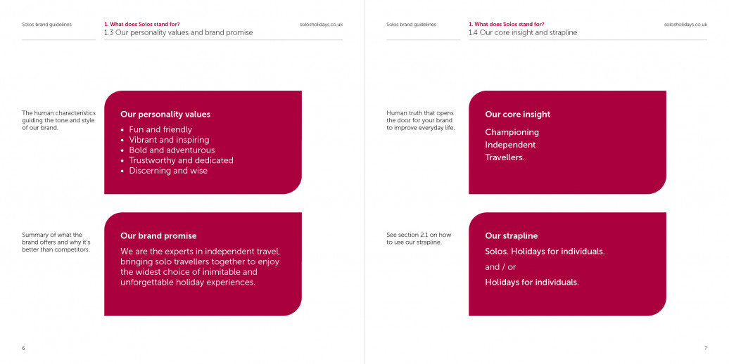
We invited Solos customers to associate with all of the exciting, adventurous and proud positives of independence.
—
Solos customers aren’t ‘singles’ or ‘people traveling solo in a group’. Instead, through a new tagline ‘Holidays for Individuals’ the positives of independence apply equally to their traditional customer base and the broader, younger audiences they were keen to attract.
—
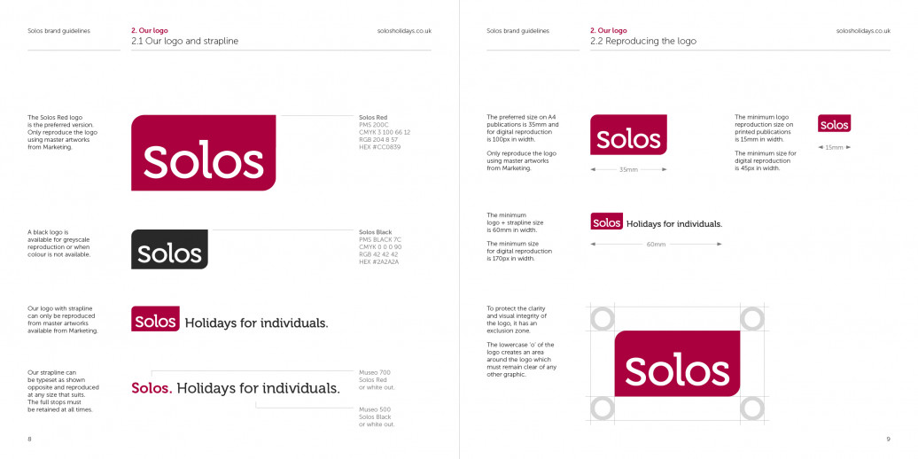
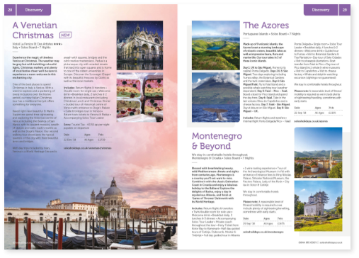
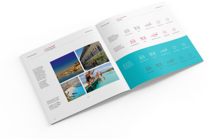
Following their new strategic positioning, we designed a set of refreshed logos and a brand guidelines document which would ensure consistency across all future collateral. We then applied their new visual identity across a wide range of assets including direct mail, web, email, stationery, ads and social.
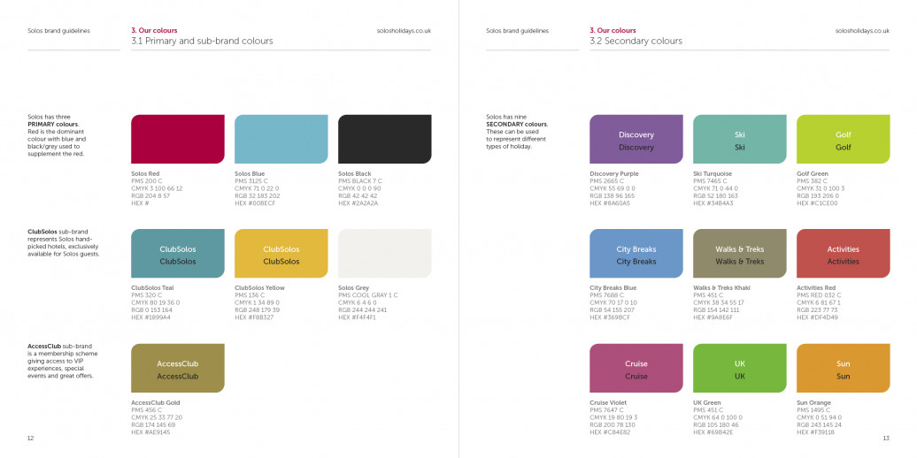
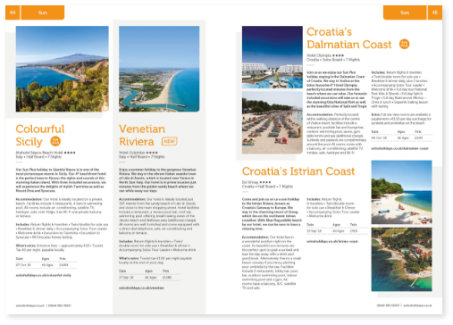
Each of Solos’ subsidiary brands now have their very own colour palette which compliments the core red tones used throughout Solos’ communications, whilst clearing differentiating between the categories of holiday available with Solos.
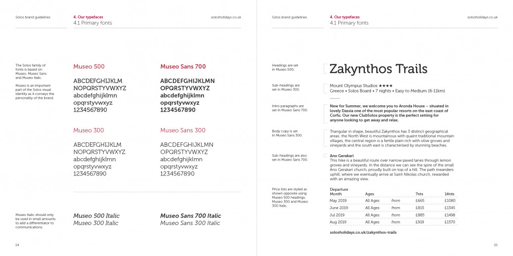
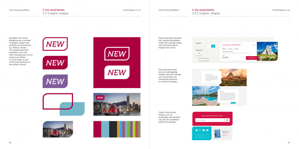
Brand guidelines
—
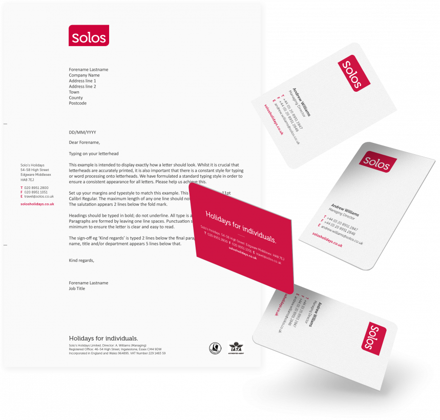
Stationery
—
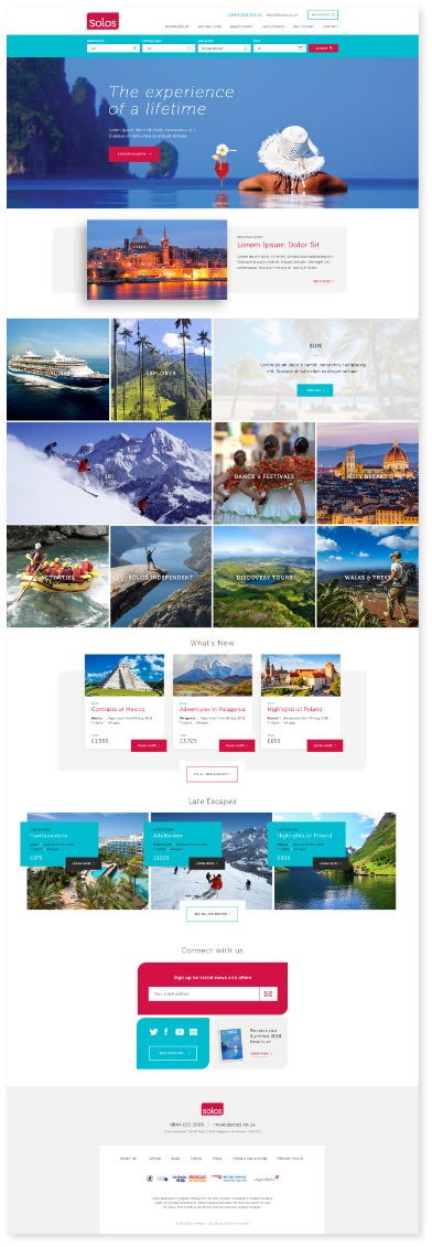
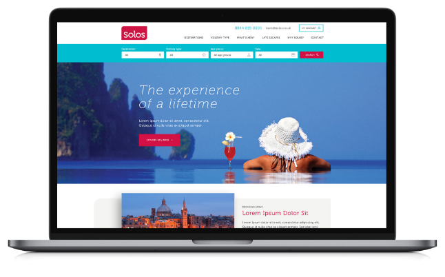
Website
—
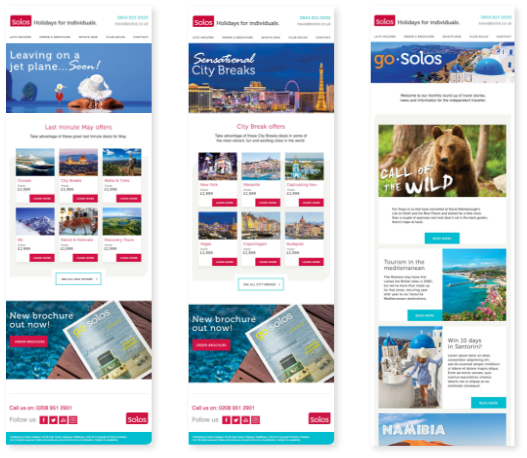
Email marketing
—
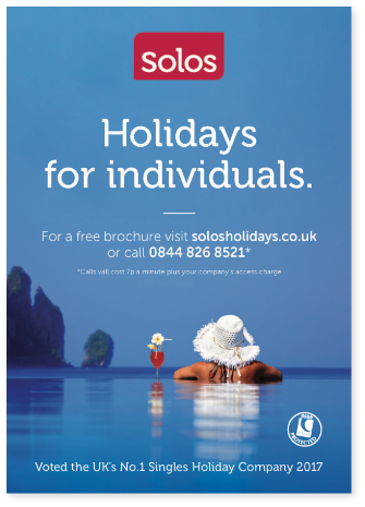
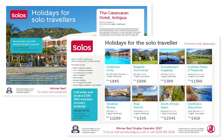
Press marketing
—

“The brand guidelines look fabulous and reflect who we are perfectly. Many thanks!”
—
Managing Director — Solos
THE RESULTS
—
With a strong brand strategy and identity aligning their business, Solos’ new brand has energised the management and marketing team, giving them a firm platform for future marketing initiatives.
LIKE WHAT YOU SEE?
—