—
Driving a powerful transformation
—
A Case Study
THE BRIEF
—
Develop a new brand identity for Local Fuels that could be rolled out across all of their regional stations.
—
Local Fuels, a Sussex based business, had grown from owning one petrol station to owning and running an impressive 13 regional stations in the space of only a few years. The business had evolved and needed a new brand identity to reflect its stature.
—
The new brand needed to appeal to a broader market and further develop the business chain. Aligning the brand with their market competitors was another key consideration.
—
Name generation
Design & art direction
Artworking
Project management

THE SOLUTION
—
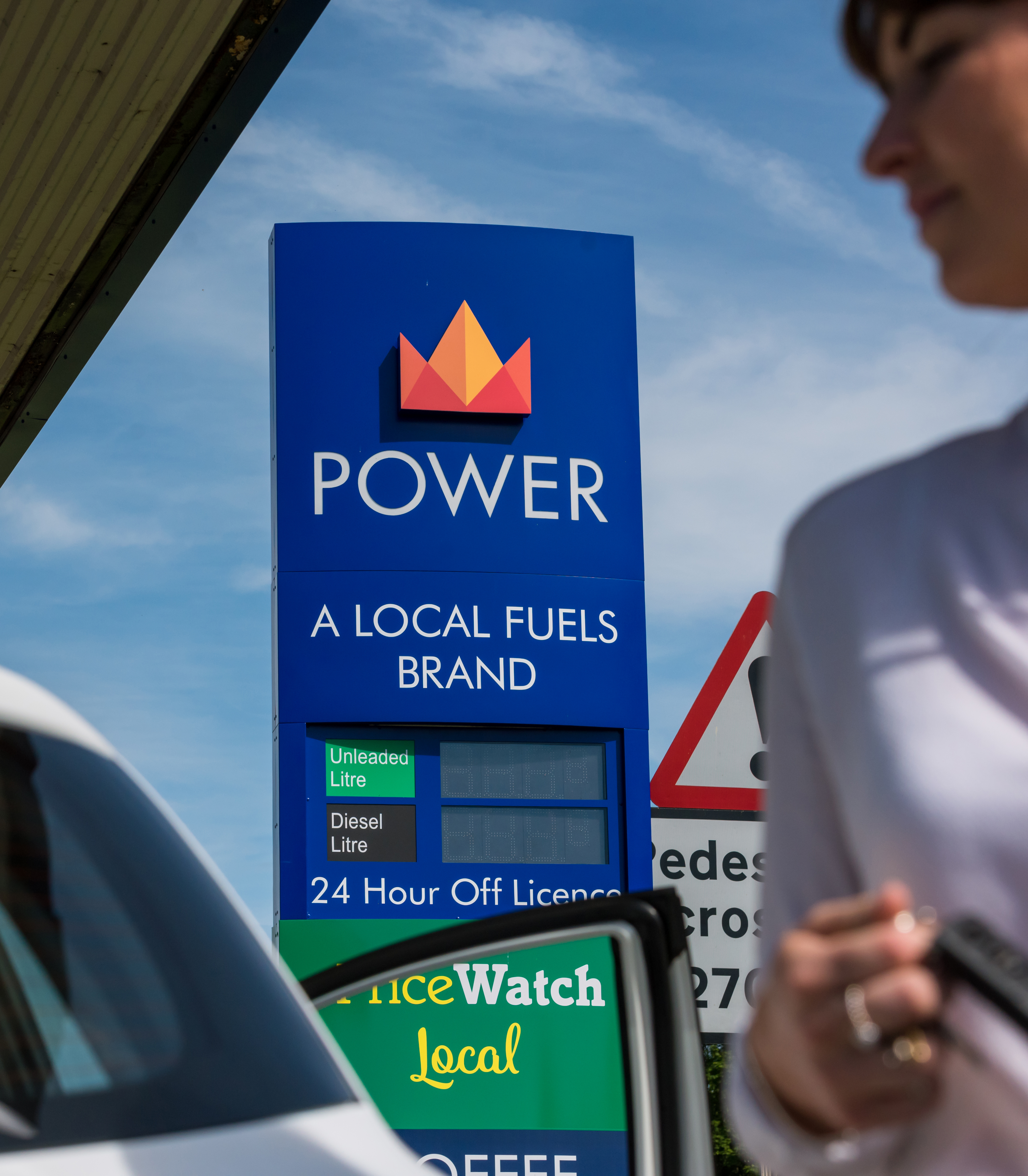
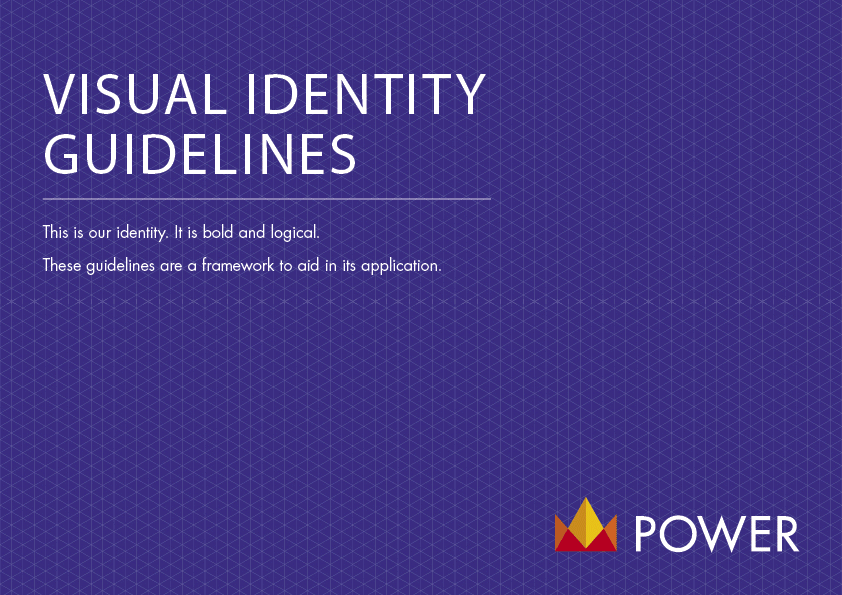
Following research, it was decided to change the name of the business from Local Fuels to POWER Fuels, which became the core of the brand’s redesign.
—
The word ‘power’ calibrates the brand entirely. It is representative of how this business has grown in such a short space of time.
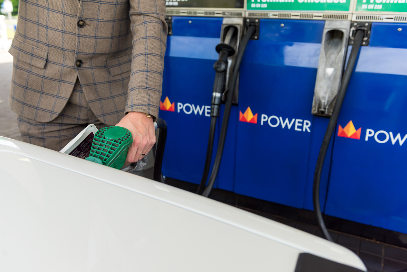
The new logo pays homage to the heritage of Local Fuels’ original flame icon but in a modernised, graphic style that represents the brand’s strong future, with a bold typeface and colour palette to match. We created the revised flame icon from six triangles, which can be de-constructed and used as an extension of the brand where required.
—
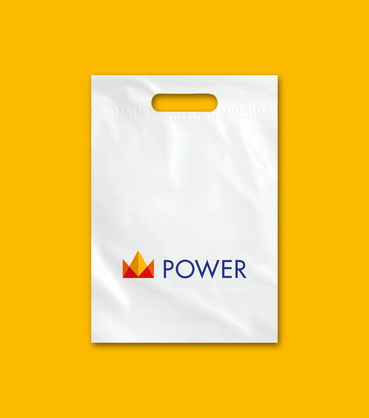
Once the new brand identity had been established, we designed and produced graphics for use across all of the service stations including photography and a range of brand assets.

THE RESULTS
—
A cohesive, clean and contemporary new brand.
LIKE WHAT YOU SEE?
—